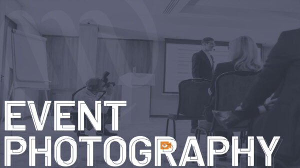
INTRO
It’s show time! The day has arrived, and attendees are flooding into the space. Our teams have spent hours, days, weeks, and months planning, creating, and organizing for this moment. It’s the sum of our collective hard work, and in a short time, it will be over. But first, we must preserve every unique aspect of the project from start to finish.
A GUIDE TO EVENT PHOTOGRAPHY
What follows is a quick guide to help our staff capture pictures of our work for promotional materials. Keep in mind we cannot post client-branded images without their full consent. We must have their permission. The safest way to proceed is to use MGME-branded work.
CONTENT & COMPOSITION
Content
Capture everything: Become a forensic photographer, capturing every aspect from every angle. If we had a hand in it, we should have pictures/video.
- Plan Ahead. Work with our team members to arrange for a time to showcase MGME branding wherever possible — take extreme caution when doing so, either ask for the client’s permission or swap logos during off hours.
- Go BIG. Spend more time on the high-ticket items, like booth designs and technology.
- But Don’t Forget the Little Things. Branding. Signage. Shirt designs. Giveaways. Collateral. Digital assets. These assets help tell the story.
- Video? Yes, Please. When possible and appropriate, use video. Avoid jerky movements and try to use smooth, fluid motions.
- “MGME Moments”. Set the tone with a shot of the empty venue, then capture interactions, crowds, and activity! We pride ourselves on making human connections, so let’s show humans connecting.
Composition
Think about the angle, lighting, subject matter & balance.
- Camera Orientation. Landscape (horizontal) vs. Portrait (vertical)? Both. Defer to the design of the content. A booth wants to be in landscape orientation, and a pull-up stand should be in portrait mode. When in doubt, use both orientations.
- Social Media Considerations. Take pictures in both orientations to ensure we utilize best practices in social spaces.
- Consider All Four Corners. Look at the content in all four corners of the frame. Is it compelling? Does your angle make sense?
- Preferred Angle: Begin by covering off the series with a head-on shot to establish the big picture. But get creative! Consider different angles, maybe a higher elevation shot inside a glass elevator or a close-up of a design detail.
- It Takes a Very Steady Hand. Use the environment to steady your hands. Lean on a wall, a table, a stand, or your colleague.
DON’T FORGET VIRTUAL EVENTS
Virtual Needs Love, Too
An equal amount of work goes into developing and deploying a virtual event, and those efforts deserve just as much of the spotlight.
- Get Those Assets! Speak with the program lead and get image files of all the work, including workstations (Acceptable formats include PNG, EPS or AI, JPG, or SVG format).
WHAT NOW?
Upload Your Work
- Have a bunch of great photos and videos? Great. Put them to good use by uploading them to the Teams account channel and letting everyone know they’re there.
- Review your shots. If it doesn’t look good on your phone, it won’t look good when used for promotional materials.
- Label. Label. Label. Clearly label the folder with all pertinent information. Feeling ambitious? Break the assets into categories and label the folders accordingly, e.g., Venue, General Session, Kiosks, Activations, Crowd Shots, Signage, etc.
Our future clients are looking forward to seeing our work in its best light (and composition, lighting, angles,…)!